
The opportunity wasn't to copy AccountRight
MYOB was bringing more of its mature accounting capability into Essentials, its browser-based product for small businesses and accountants.
Bank feeds were already becoming part of the product. The design opportunity was to rethink what happened after transactions arrived: matching, allocation, reconciliation, automation and recovery.
Bank reconciliation had traditionally been highly manual — comparing accounting records against a bank statement, often line by line. It was slow, labour-intensive and prone to error.
MYOB already understood the accounting capability through AccountRight, but AccountRight was a long-established desktop product with interaction patterns shaped by a very different generation of software. The challenge wasn't to reproduce that experience in a browser.
It was to understand what users were trying to achieve and redesign the workflow around what a connected, web-based product could now do for them.
I was the hands-on UX Design Lead and sole designer in the cross-functional product team, working closely with Product, Business Analysis, Engineering and QA. Prototypes and usability walkthroughs helped us test the interaction model against both everyday bookkeeping and more complex accounting scenarios.
Keep the user in the workflow
ProblemBookkeepers could be working through large numbers of transactions. Repeatedly opening screens, navigating elsewhere and returning to the list would make an already repetitive task slower.
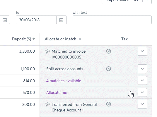
Design responseI centred the experience around the Bank Transactions list. Users could match, allocate, transfer or expand a transaction without losing their place. Simple transactions stayed simple; complex ones could progressively reveal more detail.
Keyboard behaviour, predictable tab order and familiar Enter and Escape interactions also helped users work through transactions without constantly returning to the mouse.
The common cases needed to be fast without hiding the accounting complexity underneath them.
Make uncertainty easy to resolve
ProblemA bank transaction could have several plausible accounting matches — or none of MYOB's suggestions might be correct. Rather than pretending the system knew the answer, we made uncertainty explicit.
Design responseA transaction could show five matches available and expand inline to reveal the candidates. Users could compare them, select the correct record, or search beyond the suggestions.
The important thing was not just suggesting a match. It was helping someone make a confident decision quickly and recover when the suggestion was wrong.
Make complex cases understandable
ProblemOne bank transaction could represent several accounting transactions, a partial payment, or an amount that needed to be split between accounts.
Design responseI kept the relationship visible rather than hiding it behind a wizard. Users could select multiple records and see the amounts being applied as they worked. A clear remaining balance showed whether the transaction had been fully accounted for.
The goal wasn't to remove accounting complexity. It was to make its state understandable.
Automate what the product could learn
ProblemRecurring transactions such as telecommunications, insurance, bank fees and regular suppliers could require the same allocation decision every month.
Design responseBank rules let users turn those repeated decisions into automation.
For example, a recurring Telstra transaction could be recognised from its description and automatically allocated to the appropriate expense account in future.
MYOB's purple was used selectively in the interface. A faint purple row treatment helped distinguish transactions requiring attention, while completed work was visually quieter so users could focus on the exceptions that remained.
Automate what the system can know. Make uncertainty visible when a person needs to decide.
A later MYOB rule-management iteration.
A rule connected recognisable transaction details to an accounting allocation.
Make mistakes easy to recover from
ProblemFinancial automation cannot assume it will always be right. An incorrect match or allocation needed to be correctable without putting the user into a dead end.
Design responseMatches could be undone and transactions returned to an unresolved state so the user could choose again. That ability to recover was part of the interaction model, not an edge case added afterwards.
The interface changed. The interaction model endured.
MYOB's banking experience has evolved significantly since this work. The visual design is newer and the product now includes more sophisticated automation and AI-assisted suggestions.
transaction arrives → system helps identify a match → user resolves uncertainty → allocate or split when necessary → save → automate recurring behaviour
The stronger outcome is that the interaction model continued to support the product through years of visual and technological change.